Placemaking
Argall Industrial Area

Placemaking
Argall Industrial Area
About
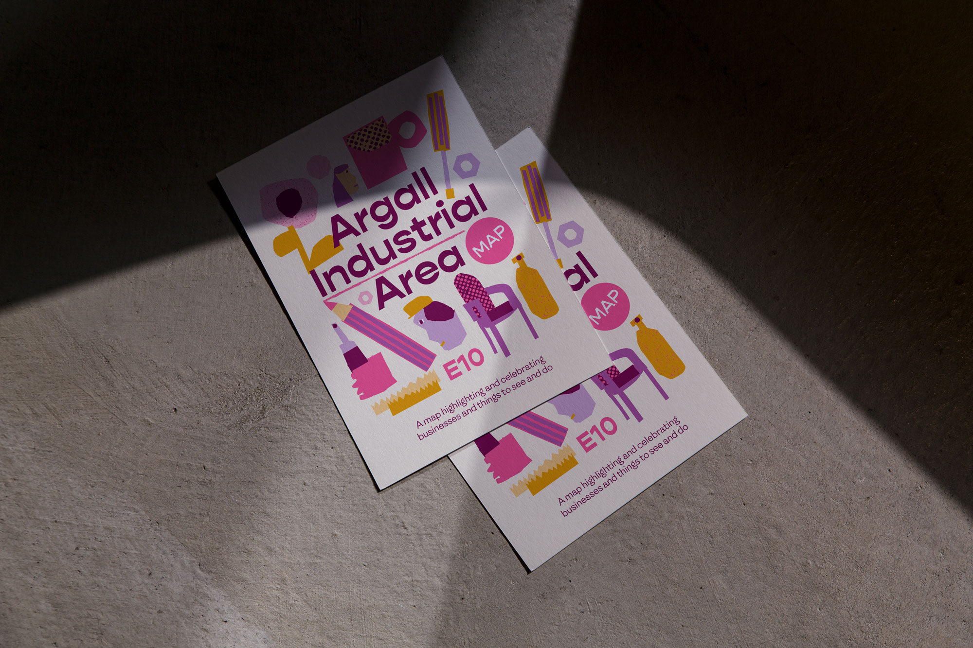
The London Borough of Waltham Forest commissioned OAT Studio to develop a visual identity for the Argall Industrial Area, a diverse East London hub home to over 400 businesses ranging from film production to brewing. With a rich industrial history, including the Black Path—a historic route that once connected markets in Hackney and Walthamstow—the area needed a visual identity that reflected its creative and industrial spirit. The project’s centerpiece was a local area map designed to showcase the businesses and attractions within the Argall Way Industrial Estate, promoting the area as a vibrant community for both locals and visitors.
Client
Waltham Forest
Category
Placemaking
Deliverables
Identity, Map, Social Media, Wayfinding, OOH


"We have been working with Oat for the last few years on a number of projects, including some beautiful identity work to help promote seasonal events. They are a joy to work with, extremely professional and wonderfully creative. They ask all the right questions to be able to pin down exactly what you want from their designs. A safe pair of very clever hands."
"We have been working with Oat for the last few years on a number of projects, including some beautiful identity work to help promote seasonal events. They are a joy to work with, extremely professional and wonderfully creative. They ask all the right questions to be able to pin down exactly what you want from their designs. A safe pair of very clever hands."
Jenny Leighton, Waltham Forest Council


Challenge
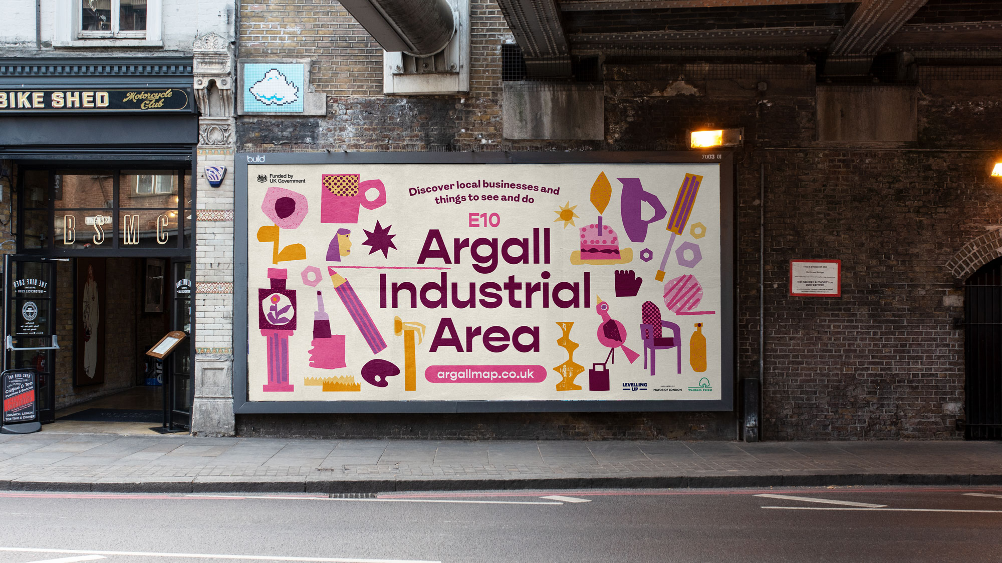
The primary challenge was to showcase and celebrate the diverse businesses and attractions within the Argall Industrial Area, many of which were hidden from sight within industrial buildings. We needed to create an area map that not only highlighted these businesses but also drew people to explore the area. The visual identity had to avoid a corporate feel, instead embodying the creative energy of the local community and giving residents a sense of ownership and pride in their area. The challenge was to create a design that was both approachable and vibrant, while effectively communicating the character of the businesses it represented.


Solution
OAT Studio approached the project by immersing ourselves in the local context, conducting thorough research, engaging with business owners, and exploring the Argall Industrial Area to capture its essence. We developed a visual identity that combined the area's creative and industrial spirit. For the logo lock-up, we selected Gopher, an unusual reverse-contrast geometric sans serif typeface that added a distinctive touch to the branding. As the core typeface, we chose F37's Britain Sans, a quirky and characterful font that draws inspiration from various elements of 'Britishness,' perfectly reflecting the eclectic mix of the area.
We collaborated with local illustrator Nicolas Burrows, whose collage-based style brought a distinctive aesthetic to the project. His work, influenced by outsider art and modernist design, helped create a visual identity that stands out from conventional approaches. Nicolas’s illustrations were used prominently in the map design, alongside custom icons representing local businesses and points of interest. The map itself was designed to be both informative and visually engaging, encouraging exploration and discovery within the Argall Industrial Area.
Further Details
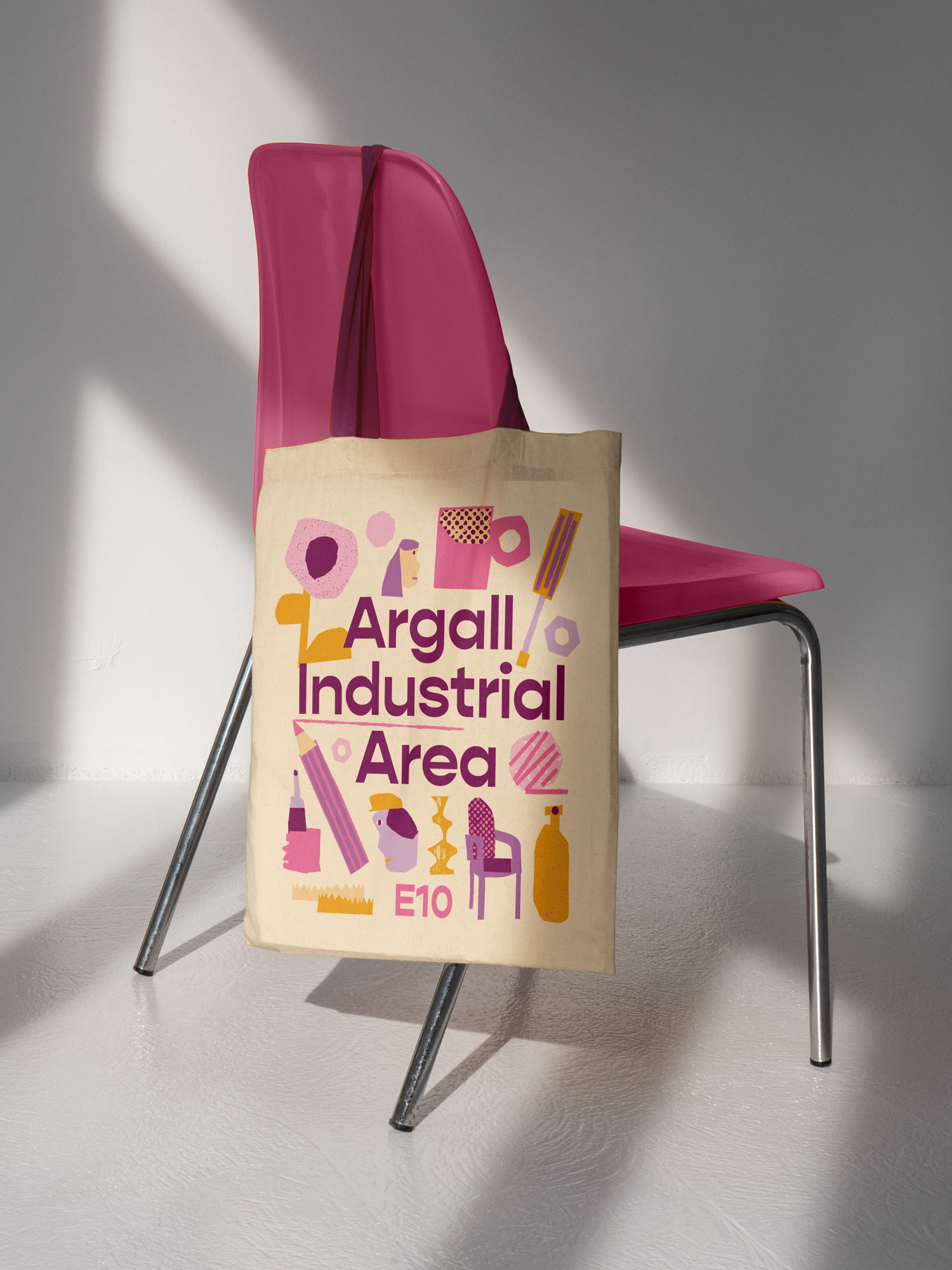
The project deliverables included a digital map with local listings, a foldable A6 printed booklet, social media designs, event flyers, tote bags, and on-site graphics like wayfinding floor vinyls, digital billboards, and vinyl banners. To ensure consistency with the broader community, we integrated elements of the Waltham Forest colour palette. The map was crafted to be both informative and engaging, highlighting local businesses and historical points of interest, with the goal of encouraging exploration and fostering community connections. The project’s success was reflected in increased foot traffic and positive feedback, sparking renewed engagement and pride, and transforming the area into a vibrant, thriving hub.
Credits
Illustration: Nicholas Burrows


Brand Identity
Honest Grind Coffee
Event Branding
Comedy Garden

Brand Identity
Honest Grind Coffee

Event Branding
Comedy Garden

Brand Identity
Honest Grind Coffee

Event Branding
Comedy Garden
Contact
Have a project in mind?
Let’s chat.
Book a free consultation to explore your vision.
Studio
Newsletter
Sign up for our (occasional) newsletter for updates
and insights. No spam, just quality content.
© Oat Studio 2026
Contact
Have a project in mind?
Let’s chat.
Book a free consultation to explore your vision.
Studio
Newsletter
Sign up for our (occasional) newsletter for updates
and insights. No spam, just quality content.
© Oat Studio 2026
Contact
Have a project in mind?
Let’s chat.
Book a free consultation
to explore your vision.
Studio
Newsletter
Sign up for our (occasional) newsletter for updates
and insights. No spam, just quality content.
© Oat Studio 2026