Event Branding
Comedy Garden

Event Branding
Comedy Garden
About
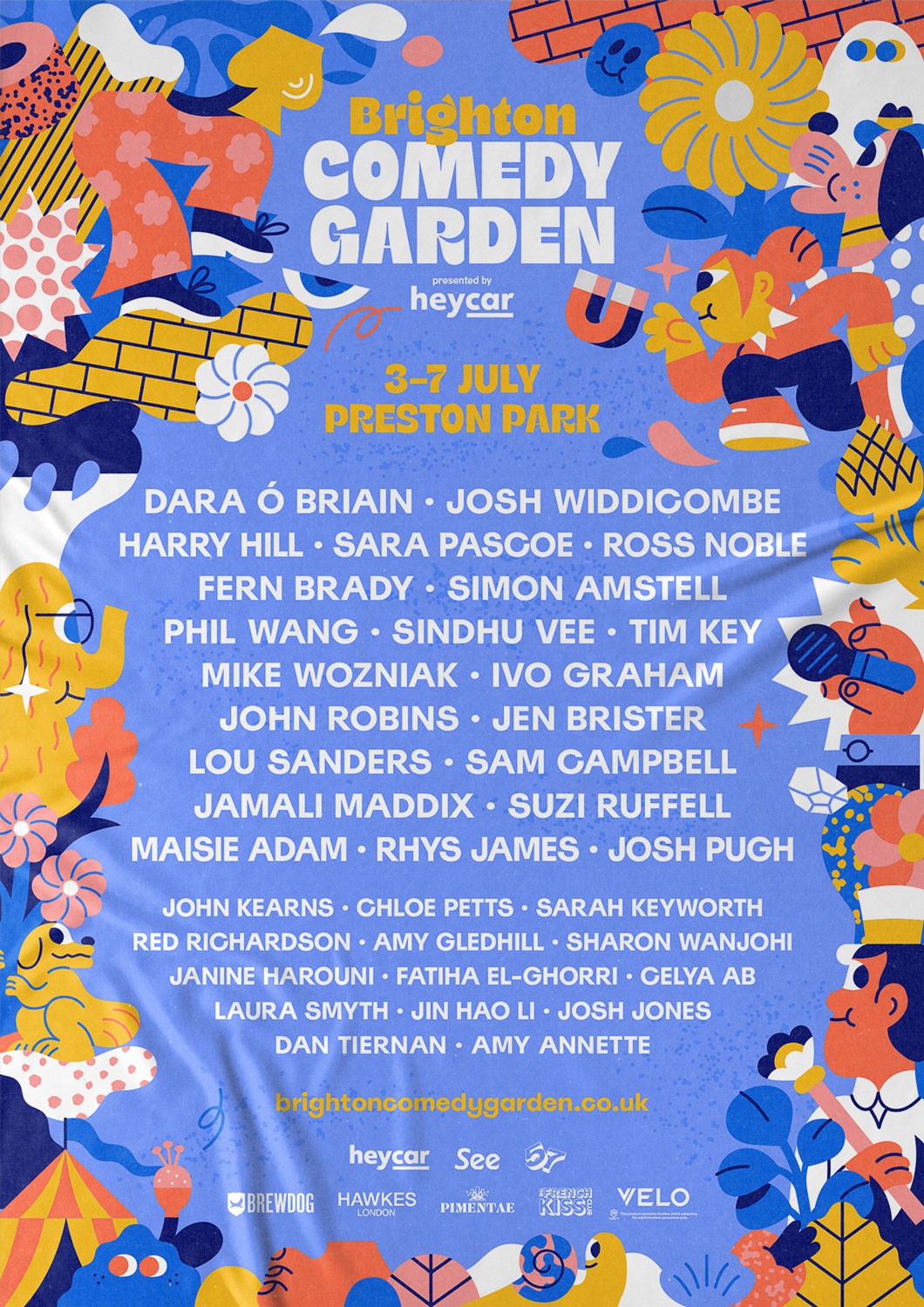
The founders of 57 Festivals collaborated with Oat Studio to refresh the branding for a series of nationwide comedy festivals, starting with the Brighton Comedy Garden. Featuring top comedians like Josh Widdicombe, Sara Pascoe, Fern Brady and Phil Wang, the festivals take place in locations such as Greenwich, St Albans, Cambridge, Brighton, and Bristol. The objective was to create branding that would capture public interest and reflect the vibrant, fun atmosphere of the events, enhancing the overall experience for attendees.
Client
57 Festivals
Category
Event Branding
Deliverables
Event Graphics, Campaign, Social Media, OOH





"Having been long standing OAT-admirers we were keen to bring them on board to create the brand identity for a new comedy festival LAUGHTERAMA we launched in summer '22. From concept to delivery the project had such an excellent flow, Tori & Owen are total experts and guided us effortlessly through the various phases, from honing the brief, recommending illustrators & motion designers, nailing the logo & brand kit, creating a superb portfolio of assets as well as large scale branding at the festival itself. It was an absolute pleasure to work with them, so much so that we've just teamed up again to work on another four festivals plus two more projects with them, and we cant wait to see the results!"
"Having been long standing OAT-admirers we were keen to bring them on board to create the brand identity for a new comedy festival LAUGHTERAMA we launched in summer '22. From concept to delivery the project had such an excellent flow, Tori & Owen are total experts and guided us effortlessly through the various phases, from honing the brief, recommending illustrators & motion designers, nailing the logo & brand kit, creating a superb portfolio of assets as well as large scale branding at the festival itself. It was an absolute pleasure to work with them, so much so that we've just teamed up again to work on another four festivals plus two more projects with them, and we cant wait to see the results!"
Cass Randolph, Co-Founder of 57 Festivals



Challenge
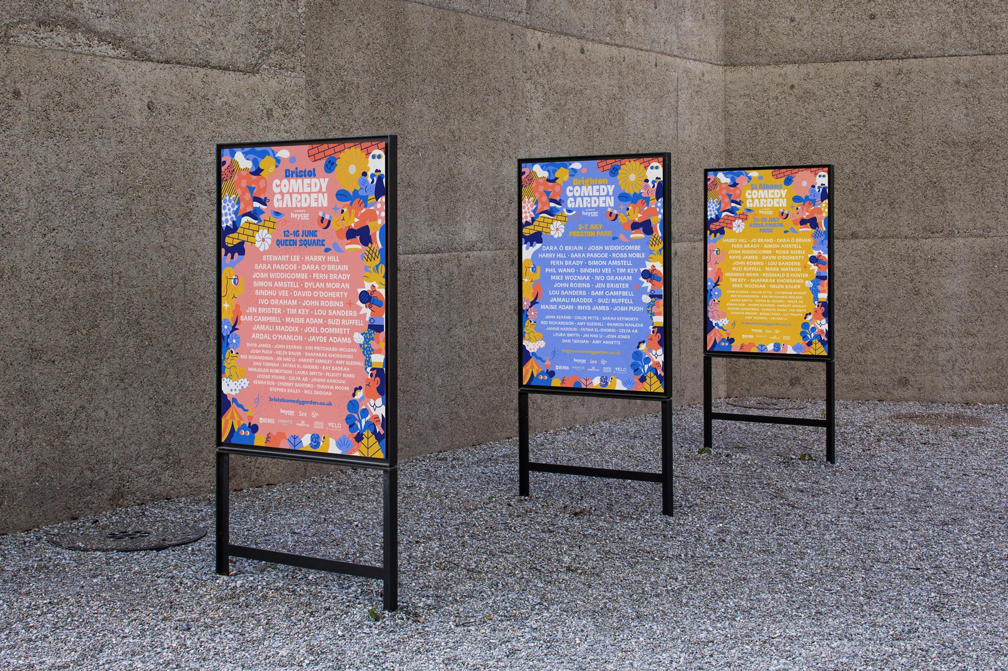
Previously, the festivals used a minimalist illustration style, but they recognised the need for a more engaging and visually striking identity. The challenge was to develop a new direction that captured the lively spirit of the festivals while also differentiating each event location. It was essential to maintain a cohesive overall aesthetic with a brand identity versatile enough to be applied across various platforms.



Solution
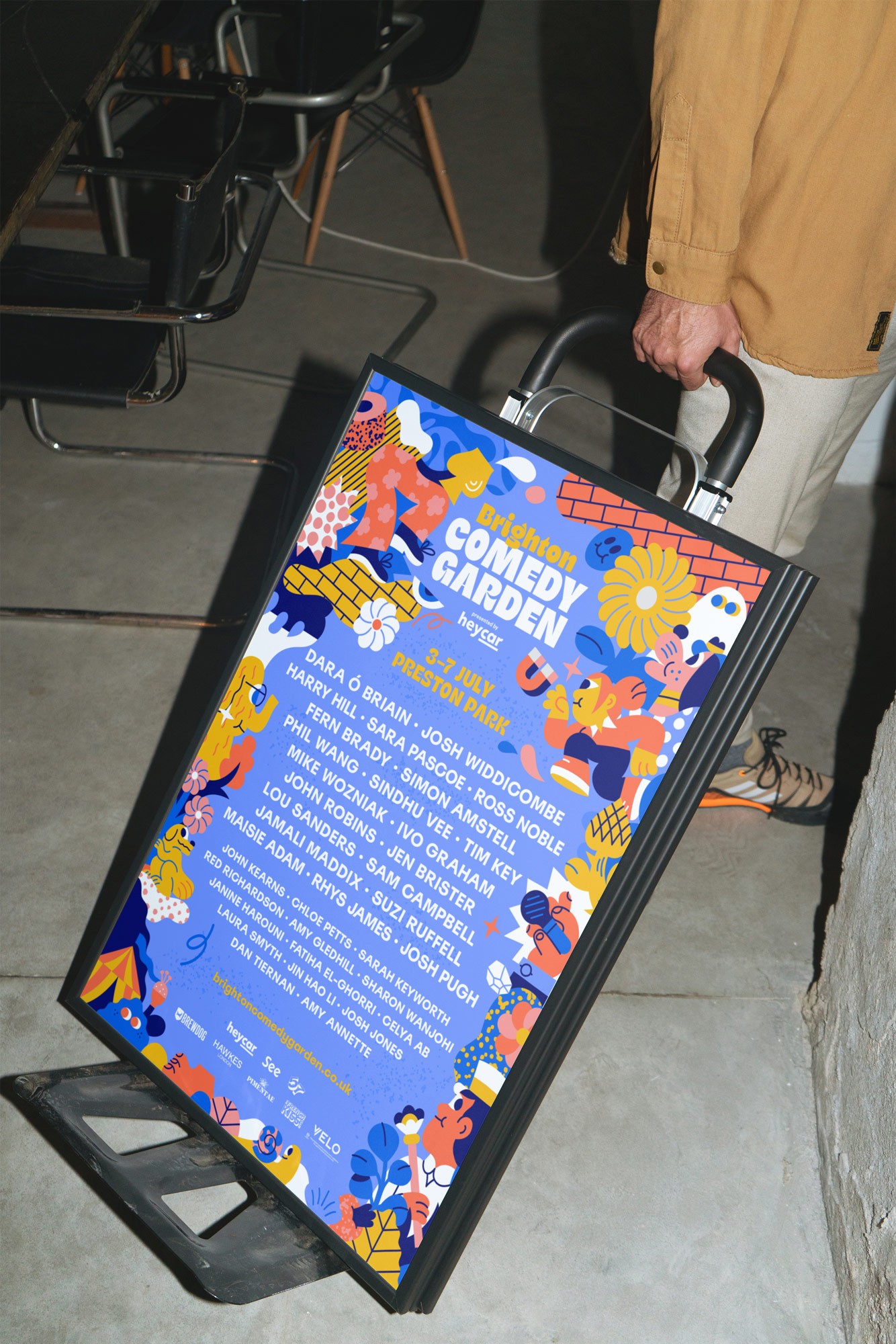
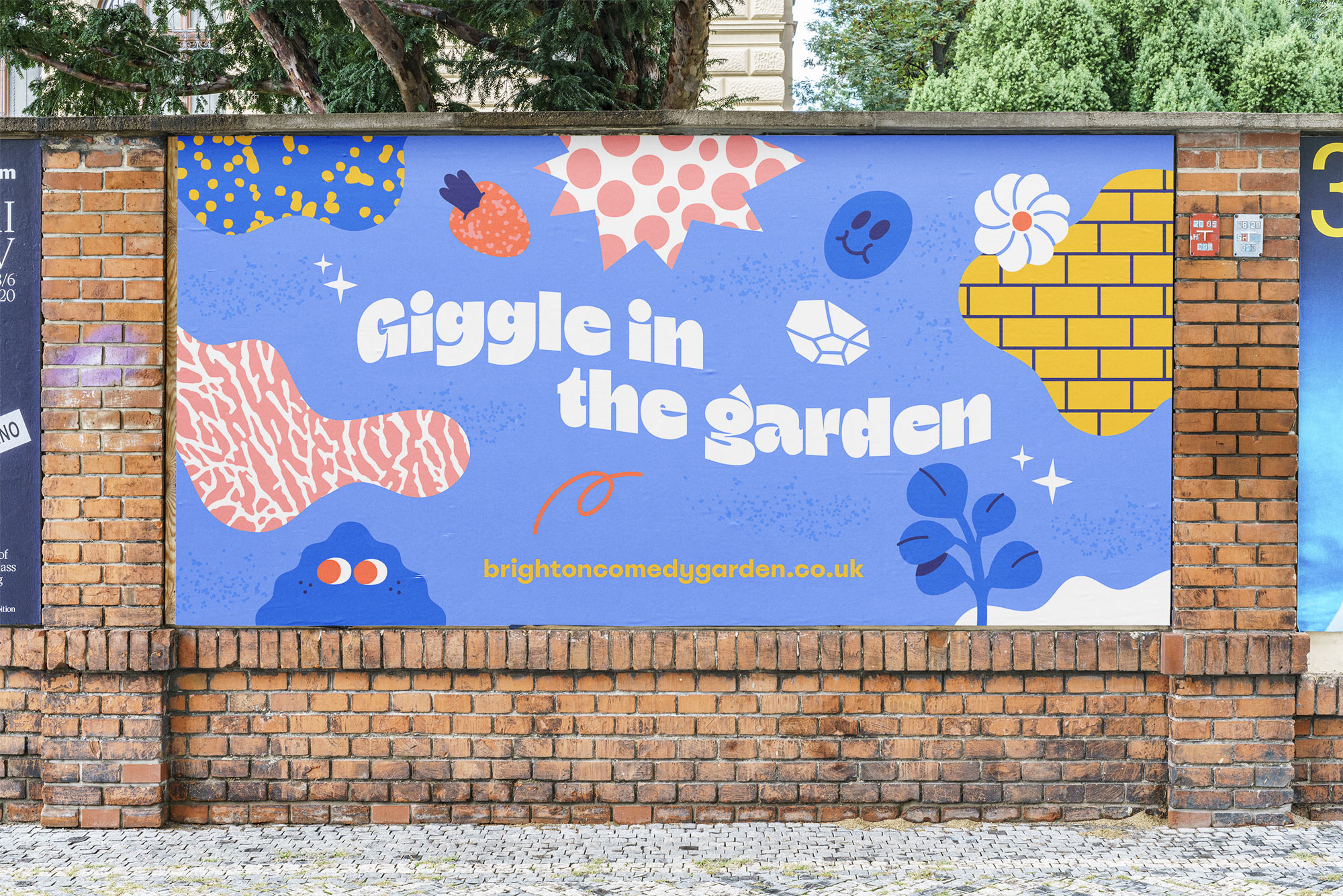
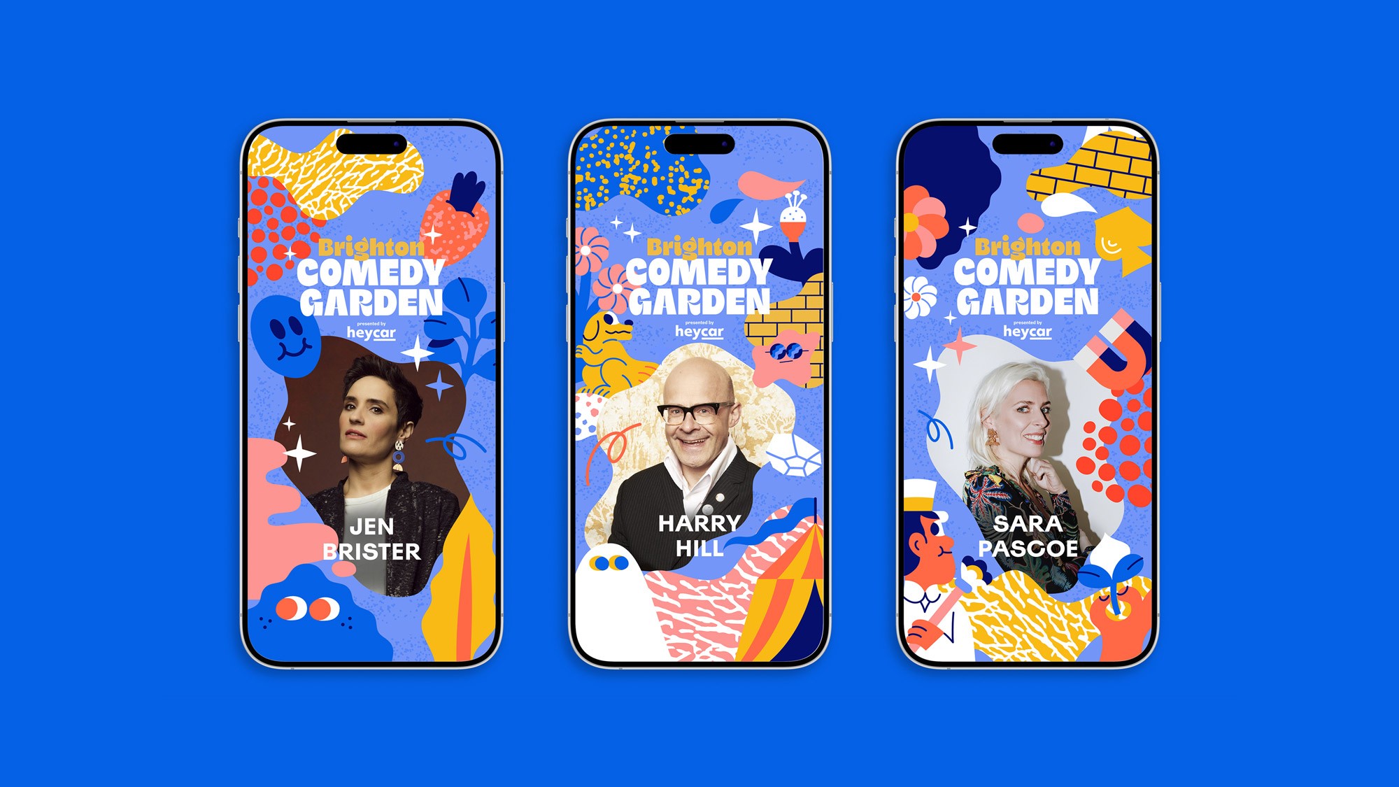
Oat Studio addressed this challenge by collaborating with illustrator Rick Berkelmans, known as Hedof, whose style perfectly aligned with the new vision. Rick created a vibrant, illustrated border filled with exotic plants, surreal characters, and abstract shapes that brought the festivals to life. These illustrations struck the right balance between fun and creativity without feeling childish. Oat Studio also designed a curvy, characterful logotype with chunky letterforms that ensured the event names stood out. A playful secondary typeface, with smile-like descenders on the y’s and g’s, added a lively touch to the brand identity.
Further Details
The toolkit of illustrations was designed for versatility, allowing them to be adapted across various applications, including event signage, social media, and web use. This flexible set of characters and shapes ensured consistency while providing enough variation for different platforms. To differentiate the Brighton Comedy Garden from the other events, Oat Studio developed a single colour palette that worked with five different background colours, each tailored to a specific festival location. Bespoke, site-specific illustration elements were also included, giving each poster unique features that maintained the series' cohesiveness. The vibrant and engaging new branding resonated strongly with the audience, contributing to outstanding ticket sales and a highly successful festival experience.
Credits
Illustration: Hedof
Brand Identity
Kota

Packaging
Kiki

Brand Identity
Kota

Packaging
Kiki

Brand Identity
Kota

Packaging
Kiki
Contact
Have a project in mind?
Let’s chat.
Book a free consultation to explore your vision.
Studio
Newsletter
Sign up for our (occasional) newsletter for updates
and insights. No spam, just quality content.
© Oat Studio 2026
Contact
Have a project in mind?
Let’s chat.
Book a free consultation to explore your vision.
Studio
Newsletter
Sign up for our (occasional) newsletter for updates
and insights. No spam, just quality content.
© Oat Studio 2026
Contact
Have a project in mind?
Let’s chat.
Book a free consultation
to explore your vision.
Studio
Newsletter
Sign up for our (occasional) newsletter for updates
and insights. No spam, just quality content.
© Oat Studio 2026