
Brand Identity
Kota

Brand Identity
Kota
About
Kota is a restaurant in Cambridge's Eddington neighborhood, located within the Turing Locke aparthotel and Hyatt Centric Cambridge hotel complex. Known for its thoughtful approach to food and drink, Kota offers brunch, wood-fired food, specialty coffee, cocktails, and craft beer, serving both locals and hotel guests across three distinct areas: a coffee shop, bar & kitchen, and terrace. The interior design subtly references classical elements from nearby St John’s College and incorporates influences from Cambridge's Brutalist 1950s era, creating a unique blend of traditional and modern styles.
Client
Kota
Category
Brand Identity
Deliverables
Identity, Signage, Packaging, Socials, Print, Digital


"I have worked with Tori and Owen a number of times in the last 8 years, the most recent being with Oat Studio. Each time they have developed an exciting brand, working within our brief and exceeding our expectations. They are extremely talented, approachable and fantastic to work with. I would have no hesitation in recommending them for your next project, you will not be disappointed!"
"I have worked with Tori and Owen a number of times in the last 8 years, the most recent being with Oat Studio. Each time they have developed an exciting brand, working within our brief and exceeding our expectations. They are extremely talented, approachable and fantastic to work with. I would have no hesitation in recommending them for your next project, you will not be disappointed!"
Matthew Knight, Founder of KOTA




Challenge
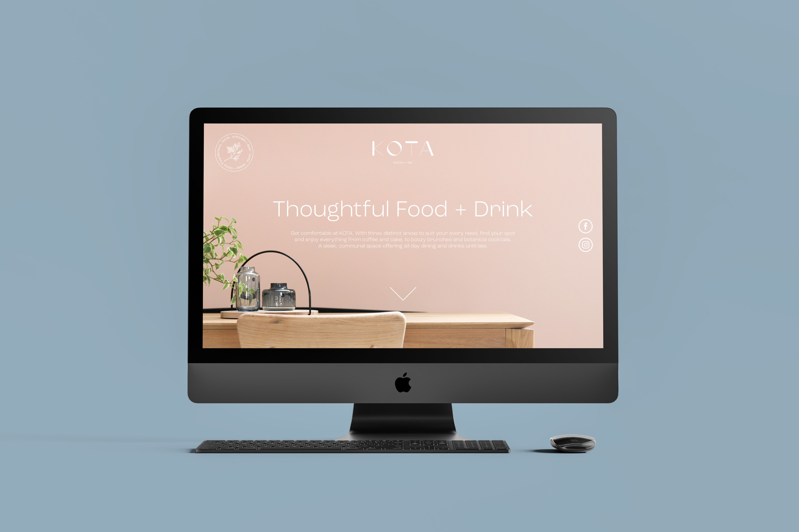
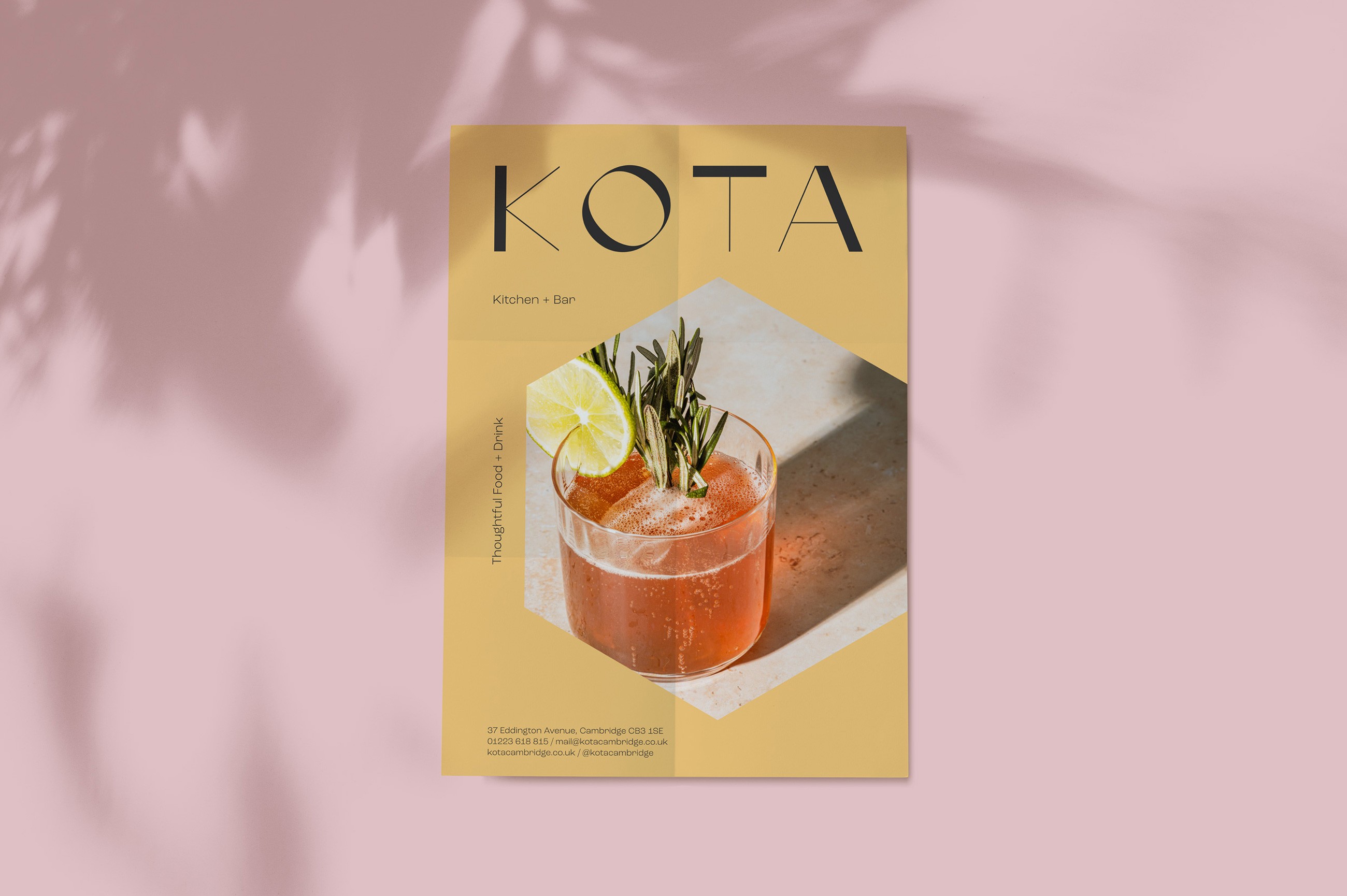
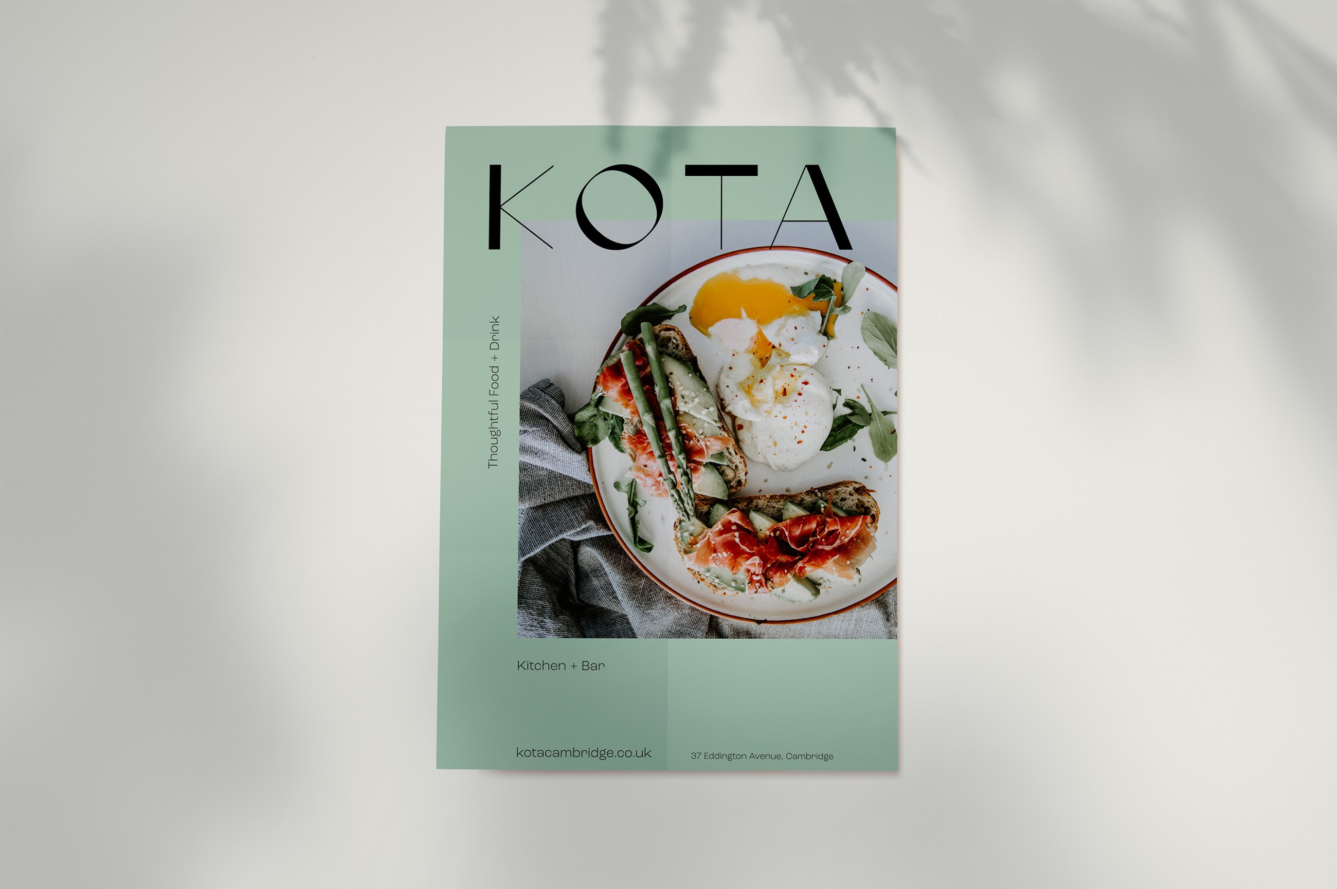
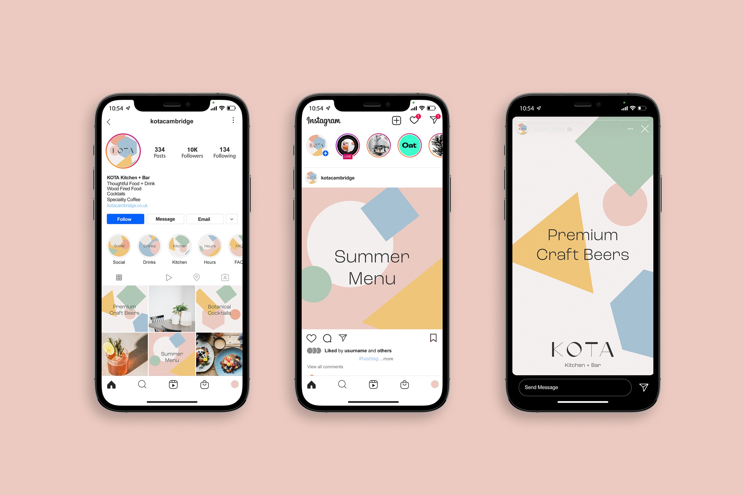
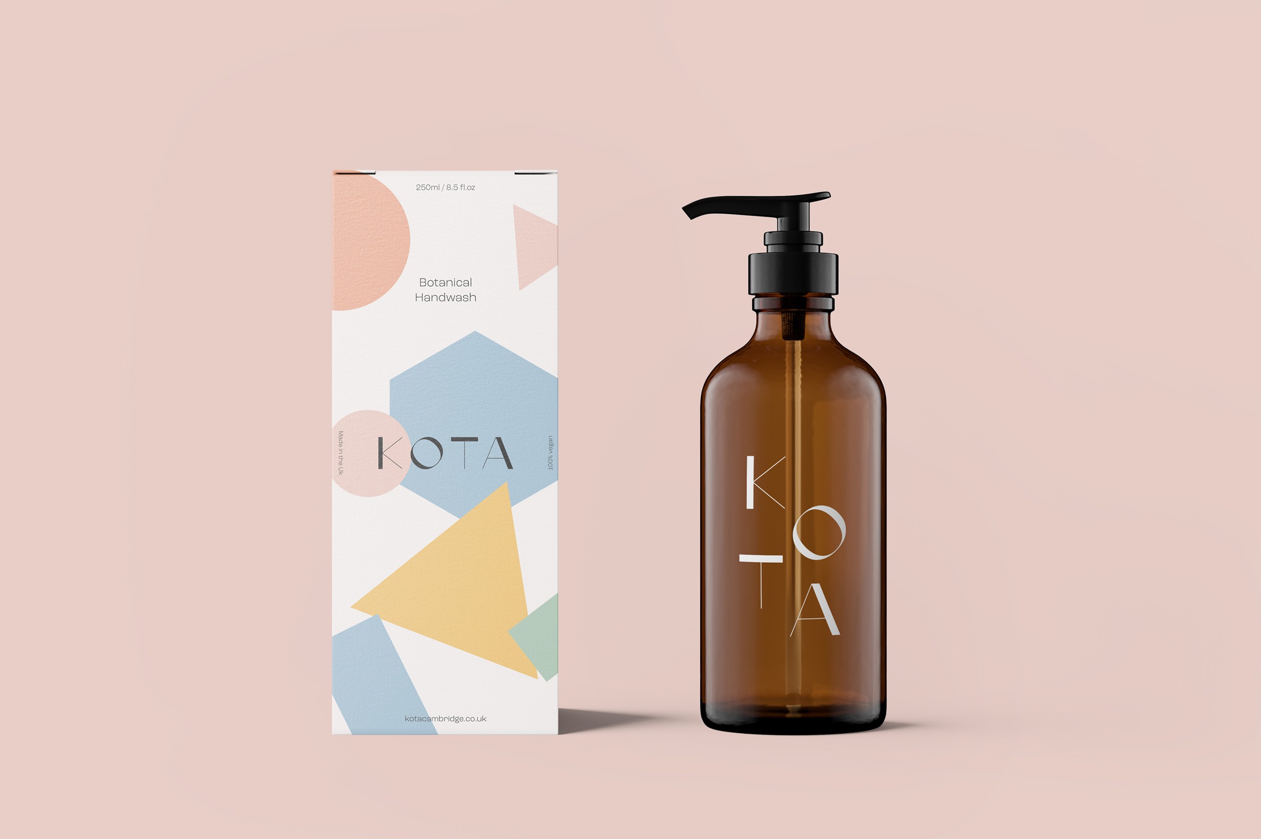
Oat Studio was tasked with creating a brand identity for Kota that captured the restaurant’s thoughtful approach to food and drink while blending its classic and modern design influences. The branding needed to reflect the refined elegance of Cambridge’s academic heritage, as well as the simple, modern shapes and colours inspired by Bauhaus and mid-century design. Additionally, the brand had to differentiate Kota from its sister brand NOVI while maintaining a cohesive connection through their shared values of independence, locality, and environmental consciousness.


Solution
Oat Studio developed a hand-rendered logo for Kota using a reverse-contrast technique to embody the blend of classical and modernist influences in the restaurant's design. We introduced Bauhaus-inspired shapes and a mid-century colour palette, bringing in simple, modern forms with a refined elegance that aligned with both the classical and Brutalist architectural references. This cohesive visual identity was applied across various materials, including business cards, drinks cans, and digital banners. To support Kota’s commitment to sustainability, we used recycled paper stocks and vegetable-based inks for all printed materials. The result is a brand that is visually striking, environmentally responsible, and perfectly aligned with Kota’s thoughtful approach to food and drink, while also complementing the NOVI brand.

Packaging
Kiki
Placemaking
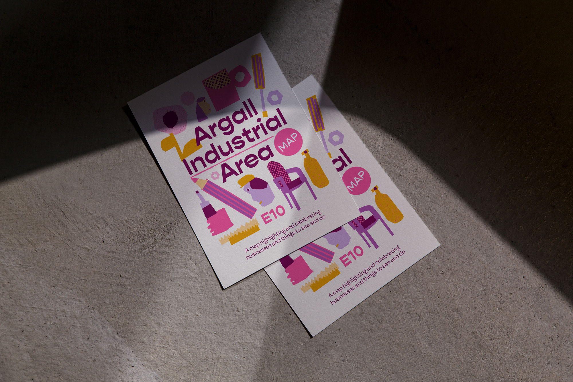
Argall Industrial Area

Packaging
Kiki

Placemaking
Argall Industrial Area

Packaging
Kiki

Placemaking
Argall Industrial Area
Contact
Have a project in mind?
Let’s chat.
Book a free consultation to explore your vision.
Studio
Newsletter
Sign up for our (occasional) newsletter for updates
and insights. No spam, just quality content.
© Oat Studio 2026
Contact
Have a project in mind?
Let’s chat.
Book a free consultation to explore your vision.
Studio
Newsletter
Sign up for our (occasional) newsletter for updates
and insights. No spam, just quality content.
© Oat Studio 2026
Contact
Have a project in mind?
Let’s chat.
Book a free consultation
to explore your vision.
Studio
Newsletter
Sign up for our (occasional) newsletter for updates
and insights. No spam, just quality content.
© Oat Studio 2026