
Packaging
Kiki

Packaging
Kiki
About
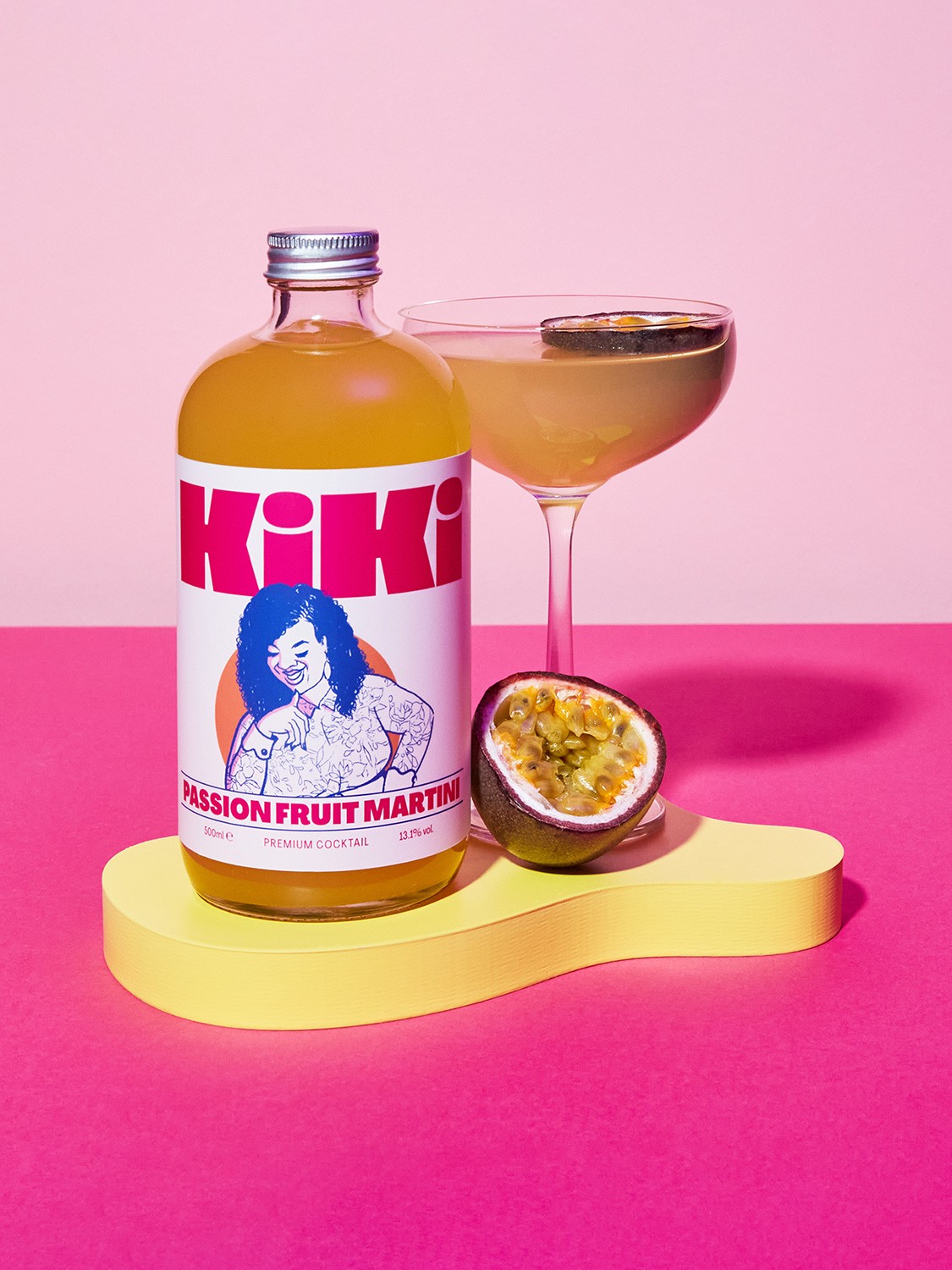
Kiki is a premium pre-mixed cocktail brand that embodies the spirit of social gatherings and lively conversations. The founders approached us to rebrand their identity and packaging after realising their previous design wasn’t making a strong impact on the shelf. The old packaging featured a logo that was difficult to notice written sideways down the side of the bottle and low-contrast illustrations that didn’t effectively convey the brand’s playful nature. Our goal was to create a new design that enhanced Kiki’s shelf presence while reflecting its vibrant character.
Client
Kiki
Category
Packaging
Deliverables
Identity, Packaging, Social Media



"With your help, we’ve achieved the on-shelf impact we were looking for, and the new packaging design has really opened doors for our brand. We’re so happy with what you’ve created – always a pleasure working with you at OAT Studio."
"With your help, we’ve achieved the on-shelf impact we were looking for, and the new packaging design has really opened doors for our brand. We’re so happy with what you’ve created – always a pleasure working with you at OAT Studio."
Tommy Mizen, Founder
"With your help, we’ve achieved the on-shelf impact we were looking for, and the new packaging design has really opened doors for our brand. We’re so happy with what you’ve created – always a pleasure working with you at OAT Studio."
Tommy Mizen, Founder


Challenge
The main challenge was to enhance Kiki's shelf impact, making the brand more eye-catching, visually distinctive, and legible. The founders wanted to retain the existing illustrations, but these needed to be more impactful and better integrated into the design. The previous bottles lacked the clarity and presence required to stand out among competitors. Our task was to create a design that made Kiki’s playful essence immediately apparent while improving its overall visibility and appeal.


Solution
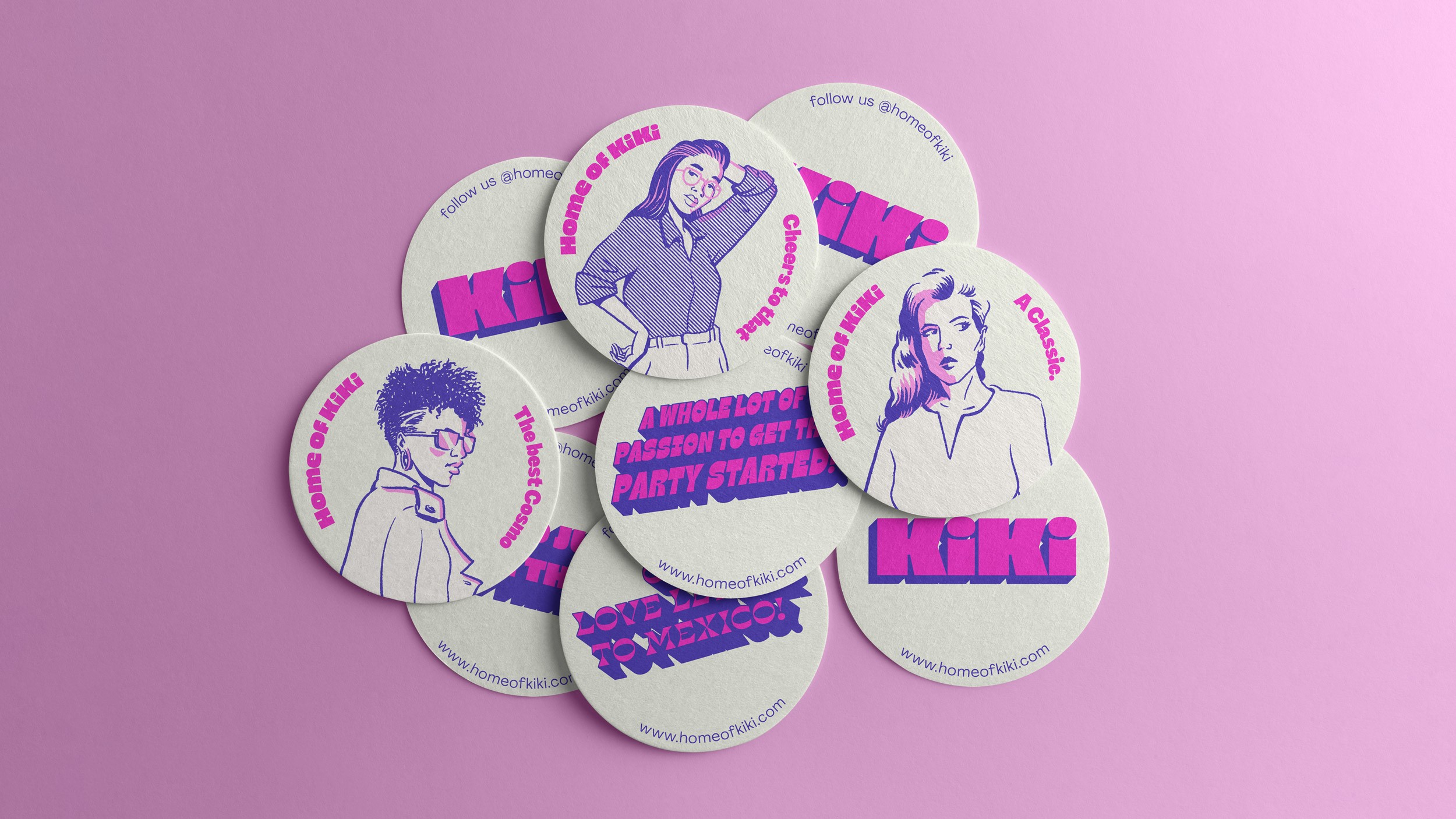
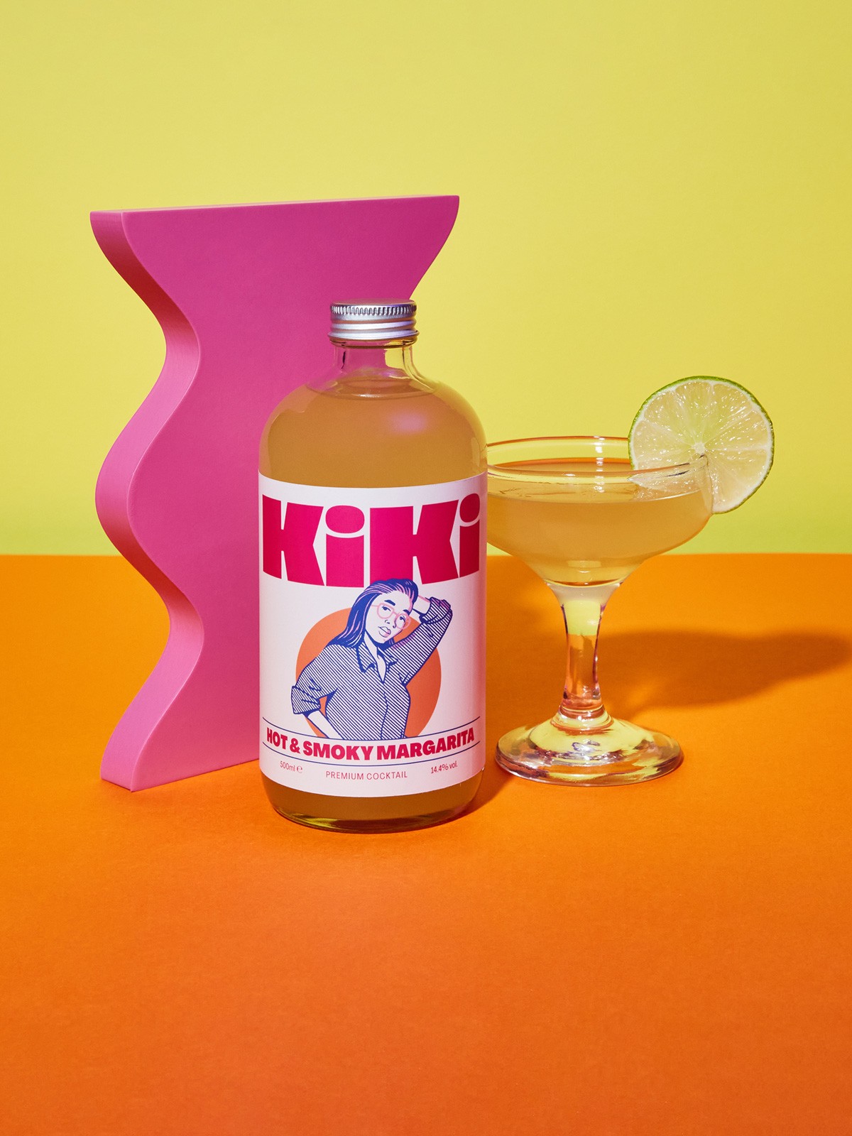
To address these challenges, we completely reimagined the packaging, focusing on clarity and impact. We moved the logo to a prominent position at the top of the label, using a curvy, characterful logotype with chunky letterforms that dominated the space, much like a fashion magazine’s masthead. This approach allowed the illustrations to interact playfully with the logo, reinforcing the theme of social gatherings. We also chose a bold, high-contrast colour palette—hot pink, bright orange, and deep blue on an off-white base—to ensure the packaging stood out on the shelf while maintaining a fresh, premium feel.
Further Details
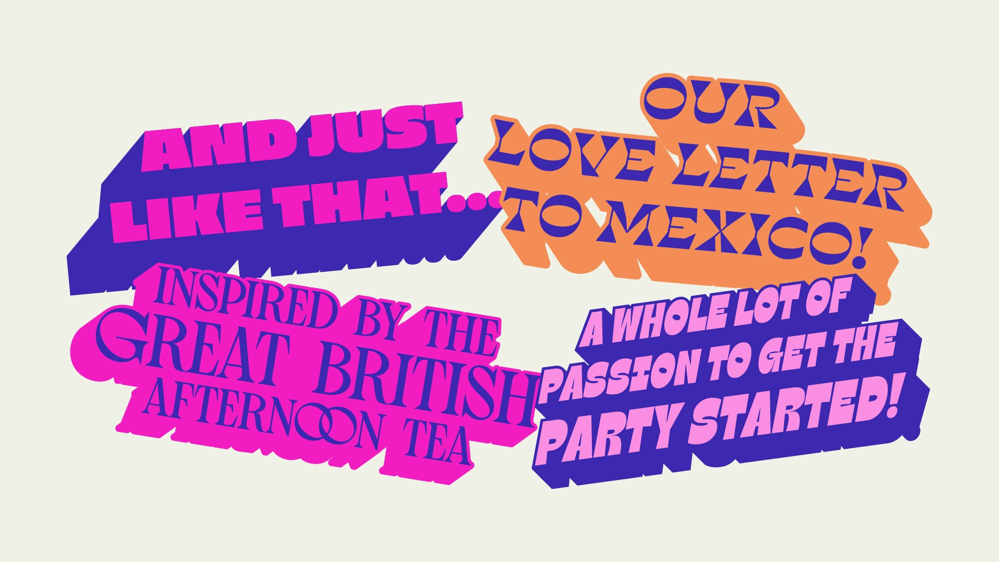
To further enhance the brand’s connection with customers, we introduced individual typographic slogans for each cocktail, such as the Cosmopolitan’s "And just like that..." adding a layer of discovery and personality to the product. This not only made the bottles more engaging but also provided ideal content for social media sharing. The final outcome is a distinctive and engaging brand identity that captures Kiki’s playful fusion of company, conversation, and cocktails, while significantly improving its visibility and appeal on the shelf. The new design successfully differentiates Kiki from its competitors, making it a standout choice for consumers.
Credits
Illustration: Nathan Brenville
Photography: Dav Stewart




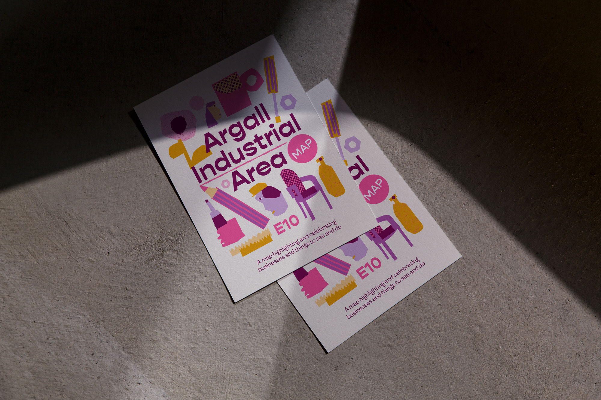
Placemaking
Argall Industrial Area
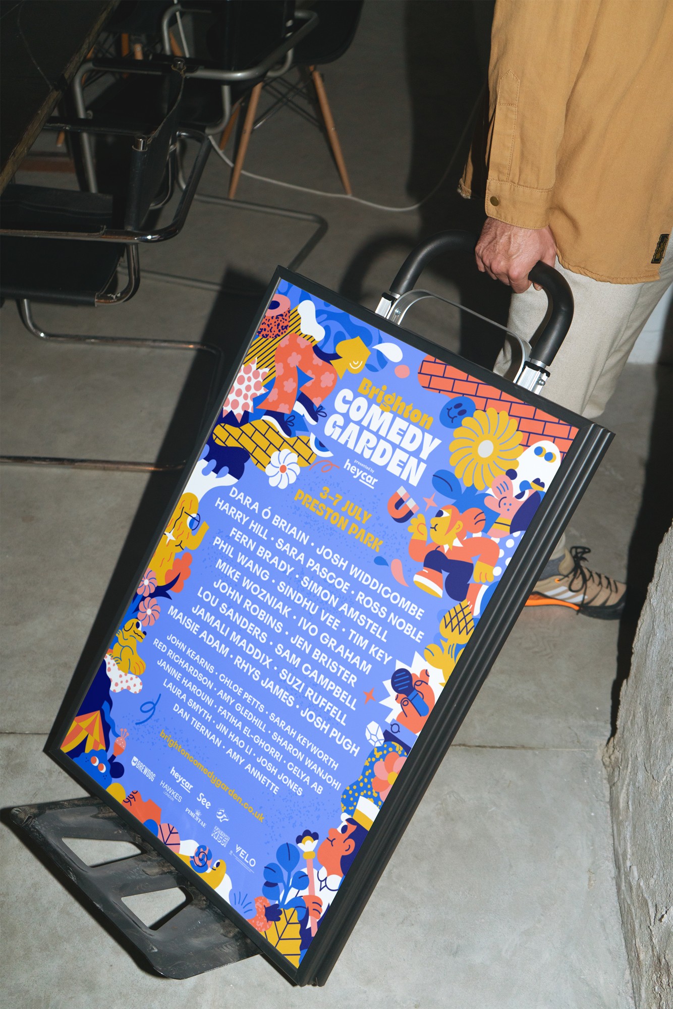
Event Branding
Comedy Garden

Placemaking
Argall Industrial Area

Event Branding
Comedy Garden

Placemaking
Argall Industrial Area

Event Branding
Comedy Garden
Contact
Have a project in mind?
Let’s chat.
Book a free consultation to explore your vision.
Studio
Newsletter
Sign up for our (occasional) newsletter for updates
and insights. No spam, just quality content.
© Oat Studio 2026
Contact
Have a project in mind?
Let’s chat.
Book a free consultation to explore your vision.
Studio
Newsletter
Sign up for our (occasional) newsletter for updates
and insights. No spam, just quality content.
© Oat Studio 2026
Contact
Have a project in mind?
Let’s chat.
Book a free consultation
to explore your vision.
Studio
Newsletter
Sign up for our (occasional) newsletter for updates
and insights. No spam, just quality content.
© Oat Studio 2026