
Brand Identity
Novi

Brand Identity
Novi
About
Novi is a high-end eatery, coffee shop, and cocktail bar located in Cambridge. Ten years ago, Oat Studio collaborated with interior designer Louisa Grey to create a brand identity that reflected Novi’s elegant interiors and ethical values, using elements like brass accents and recycled paper stocks. Now, with refreshed interiors and an evolving customer offering, Novi sought a rebrand that would stay true to its original ethos while introducing a modern, updated look.
Client
Novi
Category
Brand Identity
Deliverables
Identity, Signage, Packaging, Socials, Print, Digital



Challenge
After ten years of success, Novi’s brand identity needed a refresh to stay current and on trend. With interior design updates underway, the rebrand also needed to align with a lighter, more welcoming atmosphere. Additionally, the brand had expanded its offer—placing more emphasis on food and private hire spaces—so the branding needed to communicate these changes. Our task was to maintain Novi’s core essence of sustainability and quality while creating a fresh look that showcased the brand’s modern, vibrant nature and attracted both regulars and new customers.


Solution
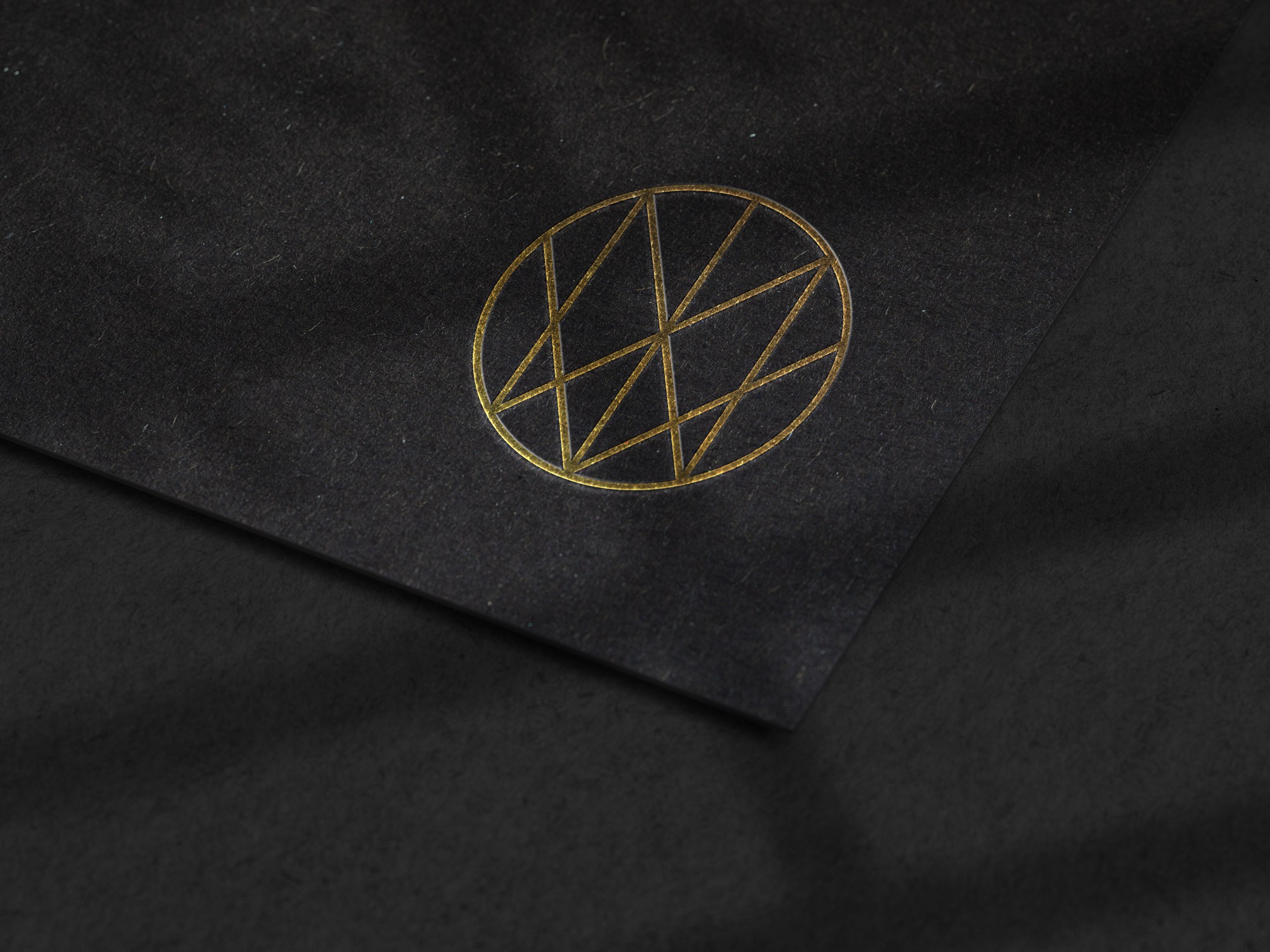
Oat Studio began by updating Novi’s logo, typography, and colour palette to reflect its evolution while maintaining its core essence. We added a hero teal colour, inspired by the greenery throughout Novi’s terrace and interiors, to create a stand-out feature across their signage and printed materials. Linear graphic shapes were introduced to add a modern, dynamic touch, and we designed an elegant monogram roundel to act as a versatile brand marker. To guide Novi’s team and external partners, we developed a comprehensive brand book that clearly outlines their values and visual identity, ensuring consistency across all touchpoints.


Further Details
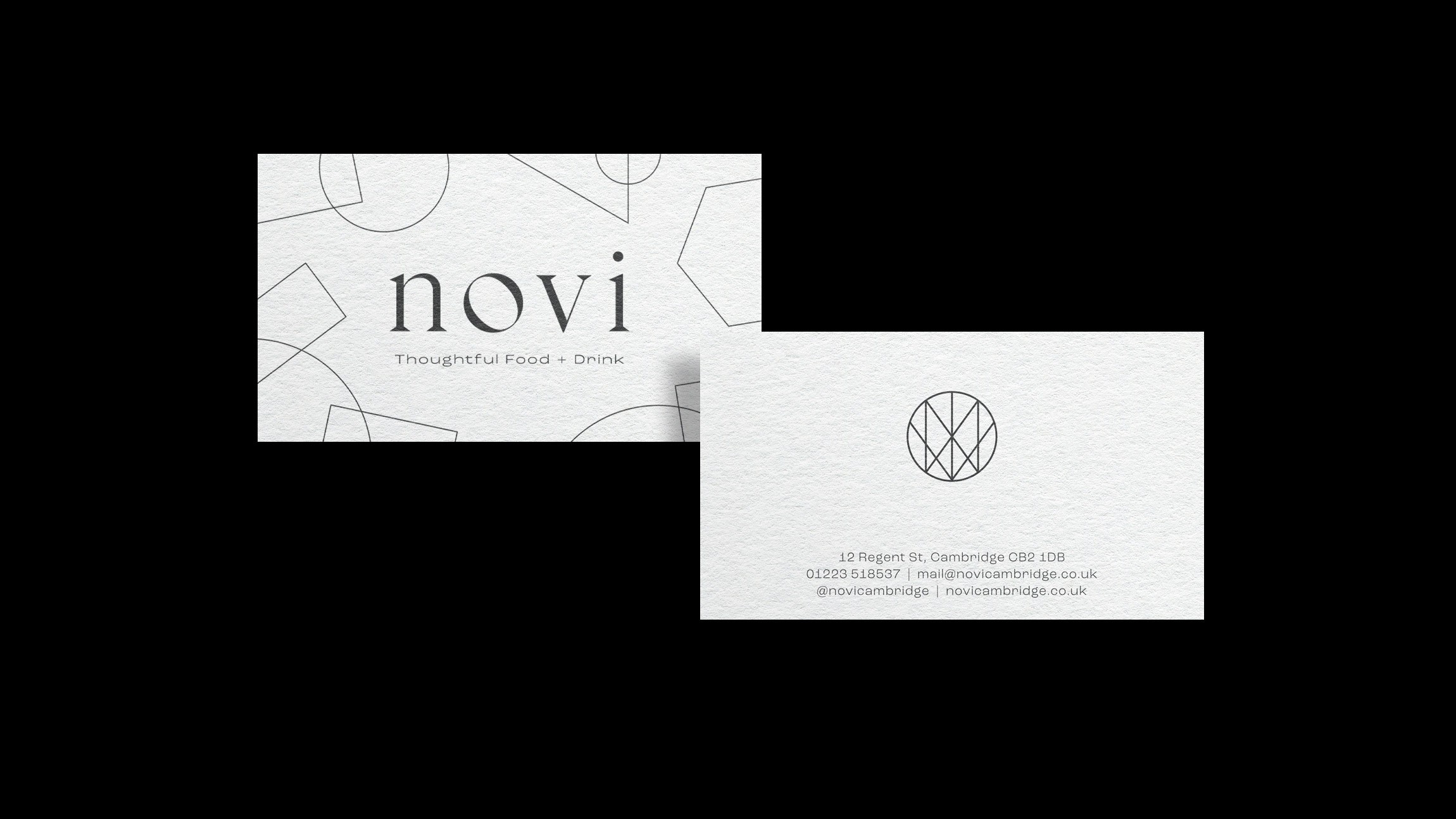
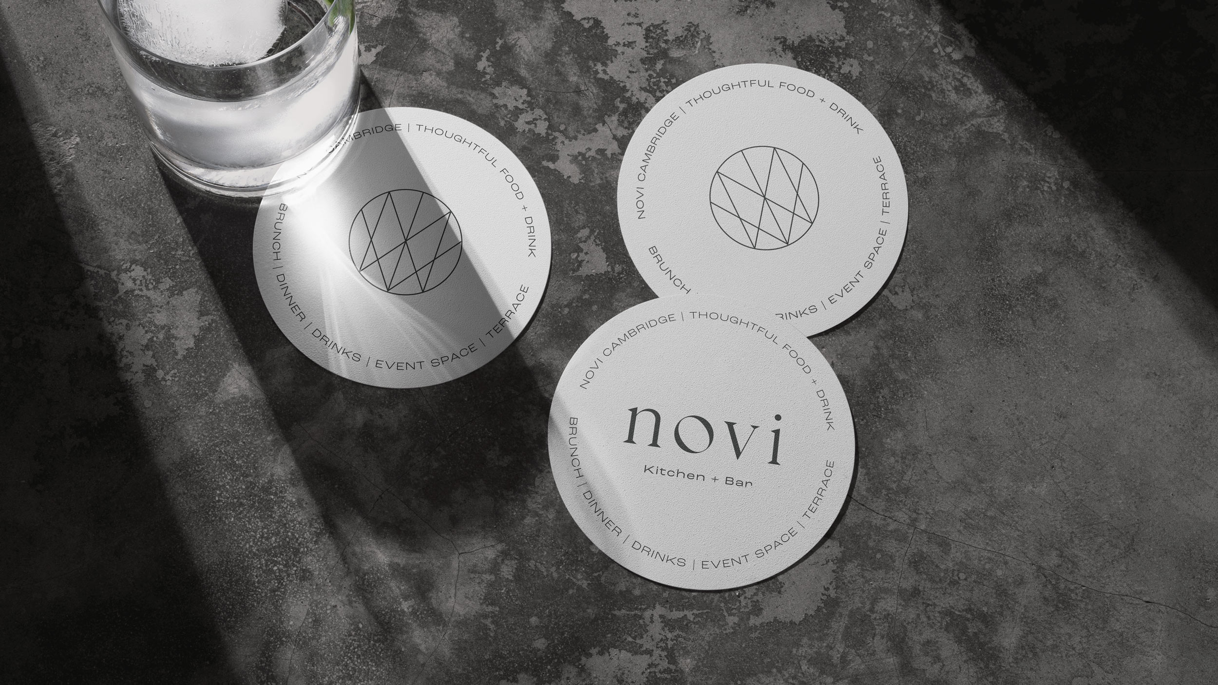
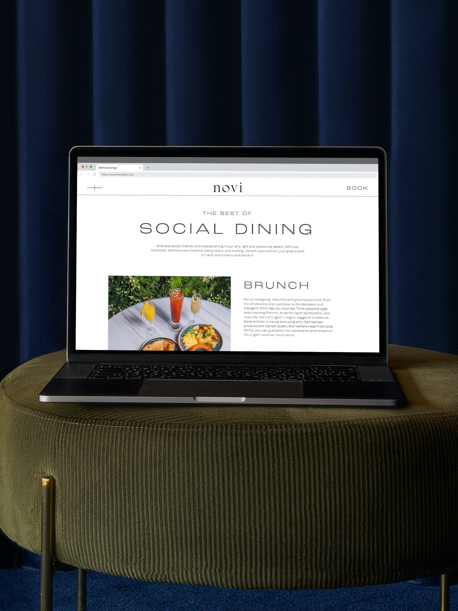
The rebrand extended beyond just visuals. We designed everything from business cards to drinks coasters, ensuring each item aligned with Novi’s refined yet approachable atmosphere. Custom signage was created for the building frontage and interior spaces, reinforcing the brand’s visibility and character. A new typography system, with Roc Grotesk at its core, was chosen to convey modernity and approachability. We also suggested easy-to-update menu boards and social media ideas to keep Novi’s branding fresh and relevant. The result is a cohesive, elevated brand identity that reflects both the updated interiors and Novi’s evolving customer offer.



Brand Identity
NVRNU

Brand Identity
57 Festivals

Brand Identity
NVRNU

Brand Identity
57 Festivals

Brand Identity
NVRNU

Brand Identity
57 Festivals
Contact
Have a project in mind?
Let’s chat.
Book a free consultation to explore your vision.
Studio
Newsletter
Sign up for our (occasional) newsletter for updates
and insights. No spam, just quality content.
© Oat Studio 2026
Contact
Have a project in mind?
Let’s chat.
Book a free consultation to explore your vision.
Studio
Newsletter
Sign up for our (occasional) newsletter for updates
and insights. No spam, just quality content.
© Oat Studio 2026
Contact
Have a project in mind?
Let’s chat.
Book a free consultation
to explore your vision.
Studio
Newsletter
Sign up for our (occasional) newsletter for updates
and insights. No spam, just quality content.
© Oat Studio 2026